Feeds:
Posts
Comments

Jugend Magazine is a weekly cultural magazine from late 19th – early 20th Century Germany. Jugend Magazine’s style became influential in the launching of Art Nouveau movement in Germany and give this movement its German name: Jugendstill ( Youth Style) . The term is still used by contemporary graphic designers to refer to German art nouveau works coming from this period.

It would not be an overstatement to say that in Germany Jugend Magazine’s style shaped Art Nouveau movement, which was expanding all over Europe since mid 1800’s. Most typical of Jugendstil was the typography, hand-lettered fonts that heavily influenced computer and graphic design fonts used today.

Some of the most known Jugendstil artists who worked with Jugend Magazine:

Dig deeper: http://www.jugendmagazine.net/

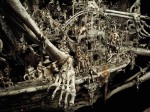
Kris Kuksi is an American scupltor who was born in 1973 in Missouri. He defines his work as “an appropriated onslaught of shit put together that otherwise shouldn’t be together in order to create a physical world of what is in my head.”   He also uses “fantastic realism” as a rather more “offical” way of putting what he does. He assembles various media and objects together to create still grotesque portait of rich details which he creates to warn us of one thing : “history repeats, and we if we dont watch out, we can recreate the history of humanking which is full of war and destruction” His sculptures often -if not always- includes loads of in depth visual stories which he takes from history to make his criticism about money-driven, consumerist, popular culture of contemporary world.

Dig Deeper: http://kuksi.com/

Arabic Calligraphy

After last lecture on ideograms and Chinese / Japanese calligraphy in history of visual communication class, I have decided to look up more on the subject.

Arabic calligraphy, closely related to Islam, was highly revered and respected, being the primary means to preserve and reproduce Qur’an.  Writing the words of Prophet Muhammad and God as well as common Islamic phrases expanded the usage of Arabic calligraphy. Arabic calligraphy has also been used to decorate architecture, especially mosques, as well as using armor, clothing, walls (graffiti) and other various external mediums such as planes.

Dig deeper :

http://www.sfusd.edu/schwww/sch618/Calligraphy/Islam_Arabic_Calligraphy.html

http://www.writtenlanguage.calligraphy-mvk.ru/content/view/30/60/lang,english/

http://en.wikipedia.org/wiki/Arabic_calligraphy

Here are some examples from Arabic/Persian/Ottoman Arabic:

With Turkey’s recent ban on myspace.com and ongoing cencorship issues on sites like youtube and 1000 more, the magazine I work for, Bant, decided to do an issue on internet cencorship. To ask for an article contribution, I knocked on Lan Franco Aceti’s door in my university. We talked briefly about what it means for Turkey to have such cencorship policy on internet sites,what kind of public perception is implied when a government decides to ban a site for the social “good” , how does it look to a European eye, and what new ways of challenging such repression is out there for the youth to overcome such silencing… Is changing one’s DNS settings the new political activism ? Or is it just a bypass that allows free websurfing survive?

Lan Franco Aceti’s ongoing art work series turned out to be pretty relevant to such subjects. “The Scream Project” and “Artistic Squatting” series merge text, visual art and virtual space on images taken from google maps. Google maps provides the digital space as satellite photographs of earth with such “technologic fidelity” that it is taken with a  perception of virtual reality by anyone who looks at it. “screams” and “words” of the author enhances this digital space on google maps with artistic manifestations, expressions and affections. To put it in a nutshell, choosing a digital space of such realistic calibre, pinning it with notes, words and images enables the artist to bypass the borders and limitations of geographical space and distance to communicate with his audience on this virtual canvas of earth simulated by new media.

Dig Deeper :  http://www.lanfrancoaceti.com/

p.s: Click on images for exact size.  More artwork from these series can be found in Lan Franco Aceti’s website, under fineart/events.

A Rather Dark Start…

After talking about several Web 2.0 sites today at the history of visual communication class, I remembered my first discovery from deviantart.com. While “favorite surfing” from profile to profile on deviant back in 2006, I met Jonathan Wayshak’s work. It was the black-white illustration of a girl with agonizing expression on her face whose hair being pulled by a big hand. She also was holding a strand of hair with some skin attached to it and the name of the work was “Let Go!” I have always been a little drawn into dark expressions of the human psych. And Wayshak is as dark as it gets.  His works can be very “in-your-face”, “offensive” and even pornographic. Yet it does have a acid humor side to it and manages to create a strong impact most of the time.

Jonathan Wayshak is an illustrator who works freelance since 1996 and does anything from comics to ad campaigns and cd covers.  He also “occasionally paints”. After passing on his name around, one friend who used to be an editor for Trendsetter Magazine in Turkey did a short interview with him which you can find here.   There is not much “official” information about Wayshak on his site and google does not help much either. All I could derive from the  exhibitions that he has been involved with, is that he is considered to be a “neosurrealist”. Wayshak defines his work as “[…] the ramblings of a mad artist. Random drawings, scraps, scribbles, and sometimes, drawings that are a little more finished than a sketch. Let’s just call it “brainstorming.” Call it “crap.” Or you can just let the work speak for itself.”

I guess what is best to do is follow his advice and let his “crap” talk for itself….